Problem
During my initial research, I found that most existing recipe apps lacked proper organization and usability. Measurements were inconsistent, interfaces were cluttered, and the best-rated app didn’t allow users to add their own recipes — only consume system-generated ones.
Moreover, several platforms used browsing data for advertising, disrupting the cooking experience. To address this, I envisioned a user-friendly system capable of automatically adjusting ingredient quantities based on the number of servings, ensuring precision and convenience.
Moreover, several platforms used browsing data for advertising, disrupting the cooking experience. To address this, I envisioned a user-friendly system capable of automatically adjusting ingredient quantities based on the number of servings, ensuring precision and convenience.
User Research & Personas
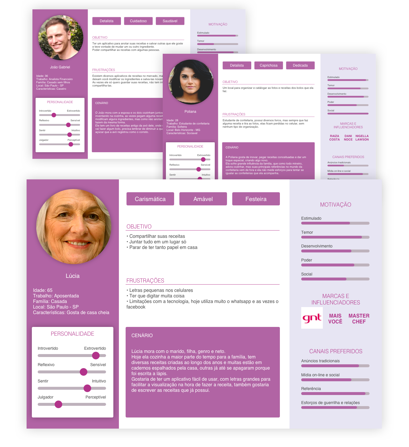
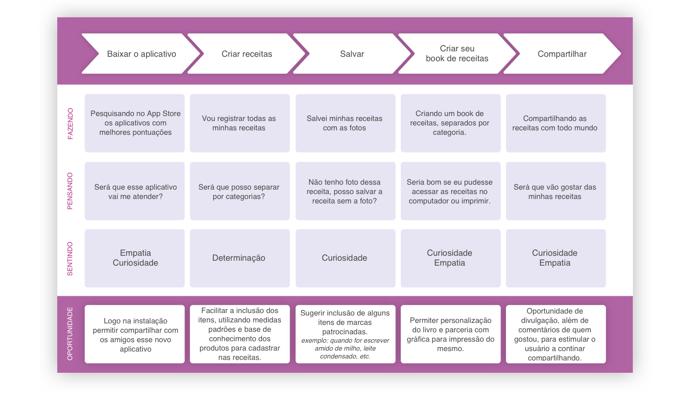
Through interviews and observational research, the target audience became clear: primarily users aged 40+, many with reading difficulties or limited technological familiarity. One key interviewee, Lúcia, offered valuable insights that shaped both the app’s information design and tone of interaction.
Her user journey became central to the design process, representing the typical home cook who enjoys archiving and revisiting recipes over time.
Her user journey became central to the design process, representing the typical home cook who enjoys archiving and revisiting recipes over time.
User Journey & Insights
Lúcia’s journey map helped identify emotional triggers — nostalgia, trust, and ease of use — as critical touchpoints. The app flow was designed around these behaviors, aiming to minimize friction in saving and preparing recipes.
Benchmark Analysis
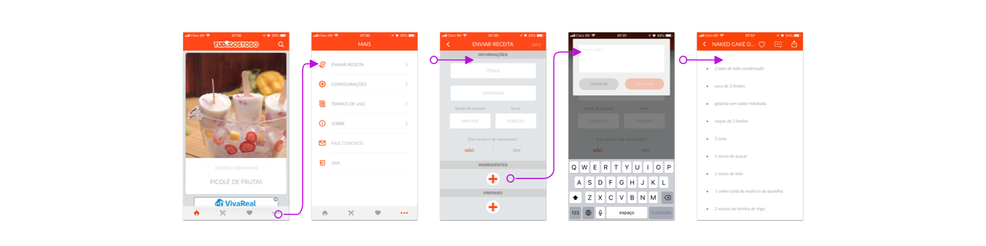
Tudo Gostoso
Popular in Brazil (10M+ downloads). Allows recipe creation but lacks formatting consistency, which leads to disorganized ingredient lists and measurement standards.
KitchenStories
Visually elegant and instructive, focusing on curated recipes and video tutorials. However, it doesn’t allow users to create or store personal recipes.
Youmian
Shows potential with smart ingredient scaling and shopping-list integration synced to smartwatches, but lacks interactive checklist functionality.
These findings guided the inclusion of structured data fields, unit normalization, and adaptive ingredient calculation — all aimed at improving the overall experience.
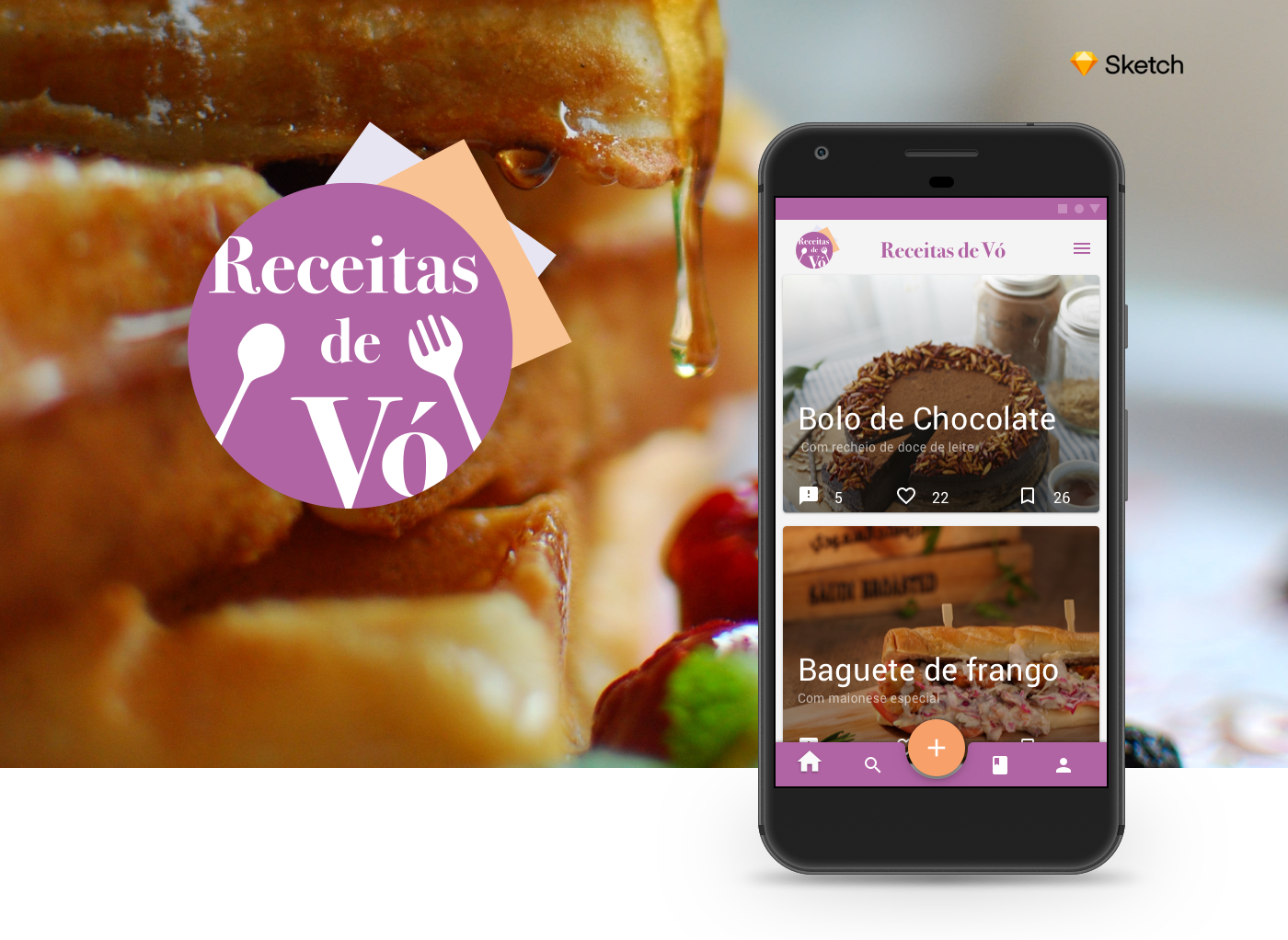
Brand & Guideline

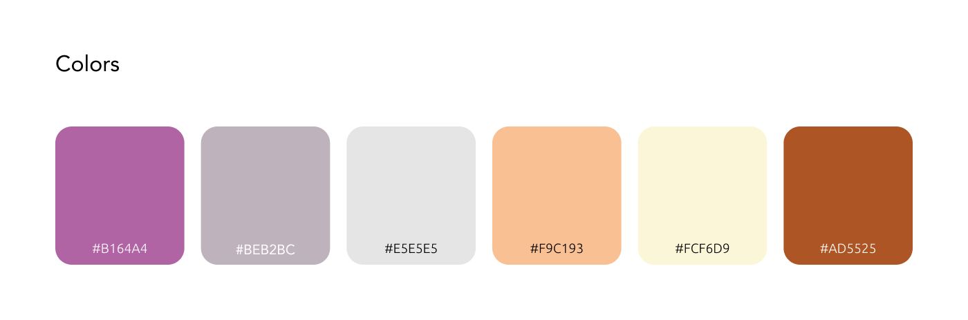
The logo design evokes the idea of a dish served and ready to enjoy, reinforcing the home-cooked essence of the product. For typography, Bodoni was chosen for its classical charm and connection to vintage cookbooks from the 18th century, while the use of magenta as the primary color adds a retro yet visually light aesthetic.

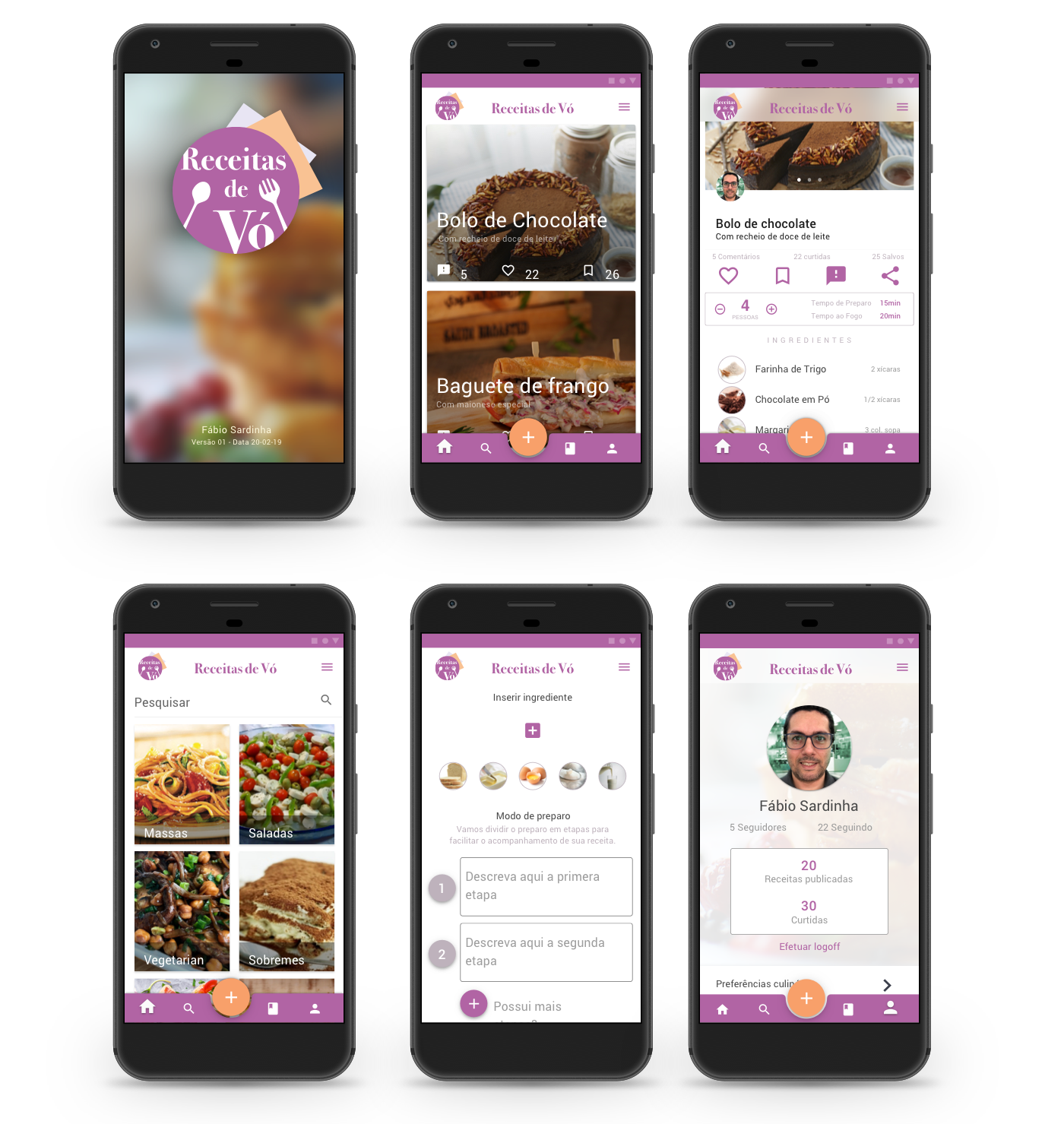
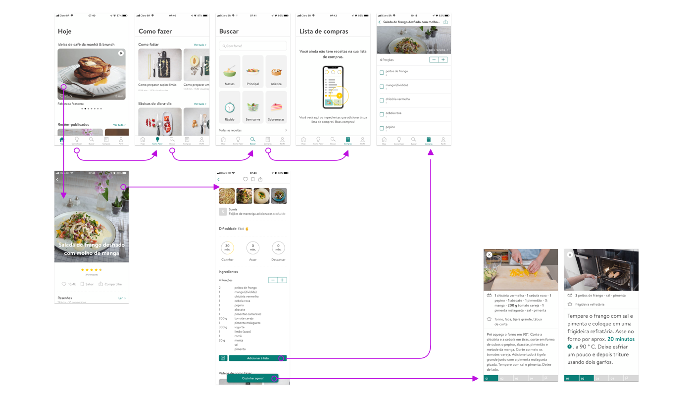
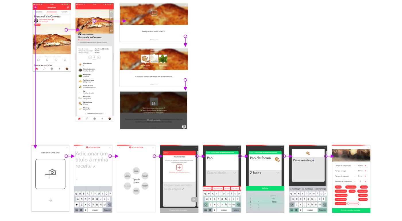
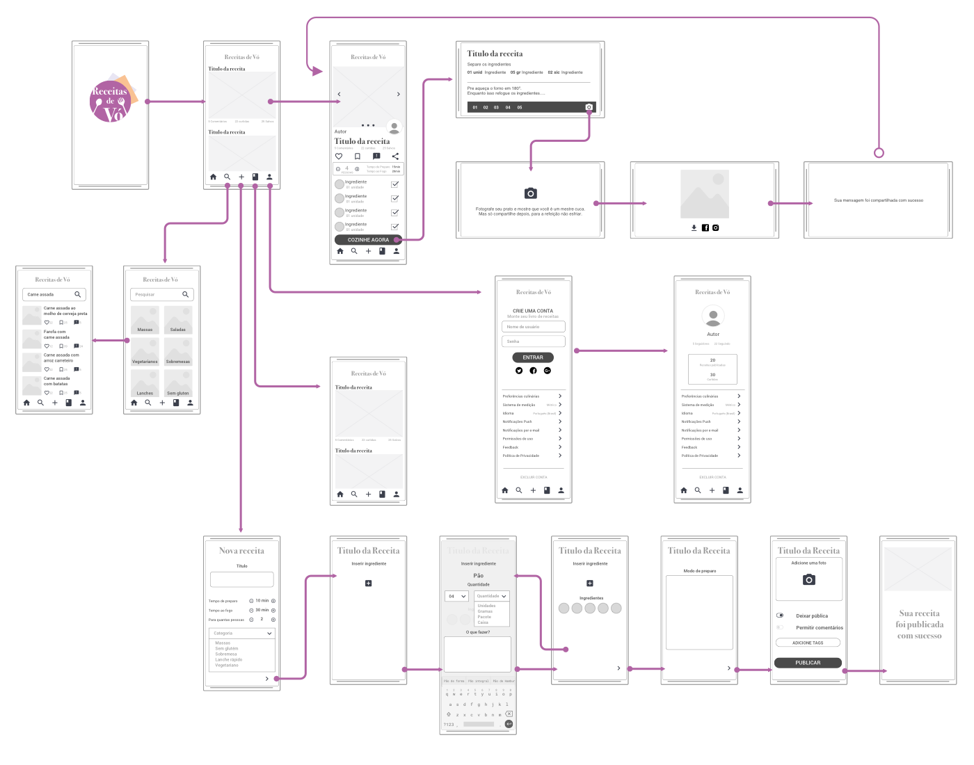
Design Process & Screenflow
Starting with user flows in Sketch, I explored all possible navigation stages to ensure an intuitive experience. This process evolved into a detailed wireframe system embedded within the screenflow, allowing the visualization of transitions between recipe entry, preparation, and shopping features.
High-Fidelity Prototype
In the prototype phase, refinements were made based on interaction patterns and accessibility testing. Visual hierarchy, icon arrangement, and text legibility were optimized to support users with lower vision or less digital fluency. Every interface element was crafted to strengthen usability and maintain emotional connection.